At last! Technique and nature in harmony!
Lithographs 2009 - 2014
Lithographs of different sizes printed on various papers
Essay by Dr. A. Strobl, Staatliche Graphische Sammlung, Munich
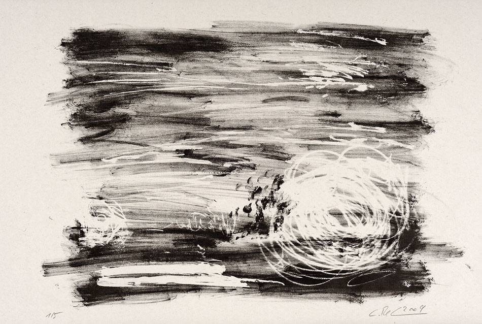
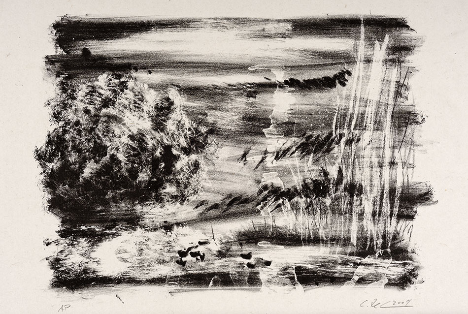
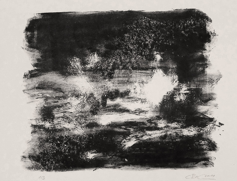
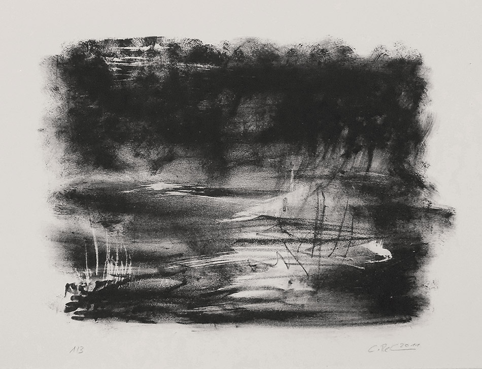
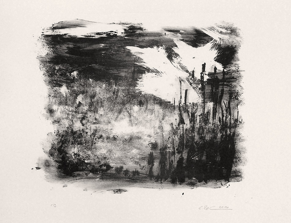
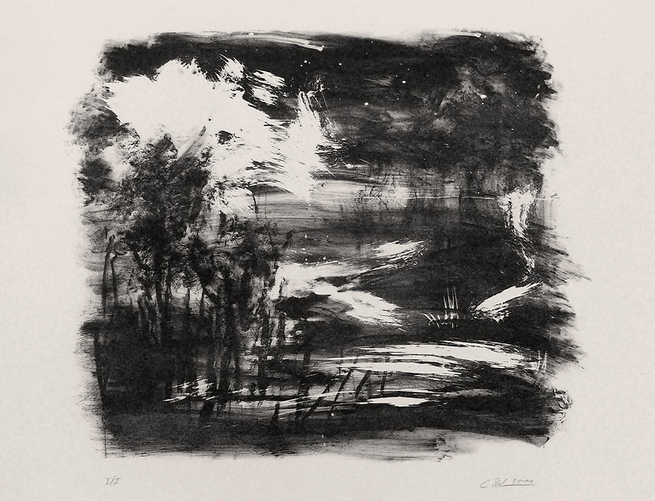
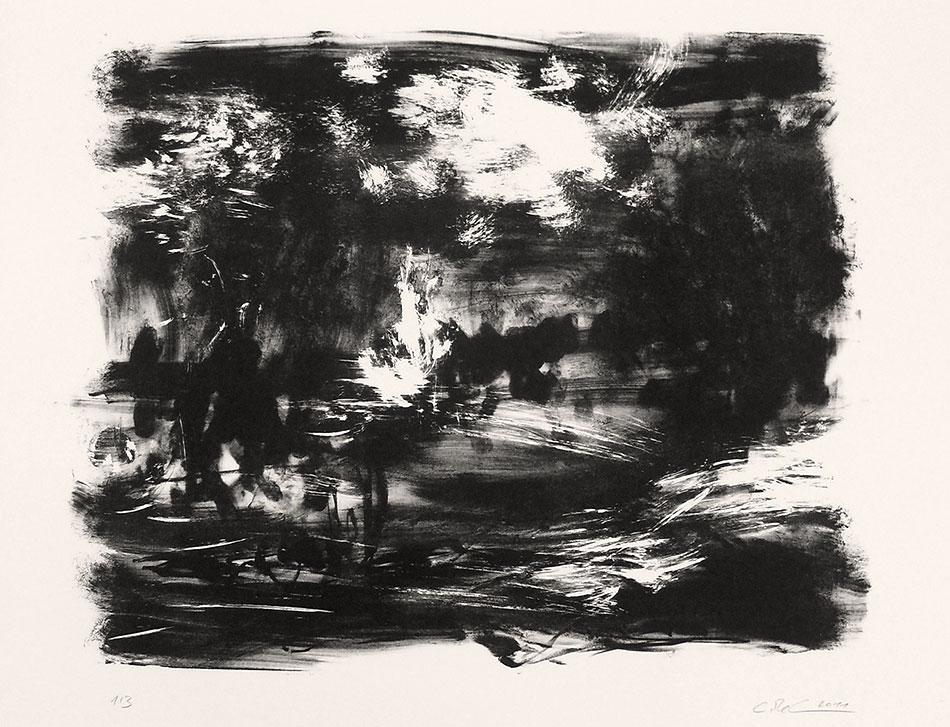
Layered streaks, swabs and chunks of color are permeated by scratches. In effect Christof Rehm's lithographs are just coarsely - for example with a cloth - smeared traces, but even so one does not see his pictures as nonrepresentational color planes. It is not difficult for us to associate these color clouds with classically structured landscapes with foreground, middle ground and horizon. Human perception is probably poled to this schematic decryption. The rhythm of the surface distribution allows us to recognize bushes, trees, barren meadows and fields and - usually in the upper third of the pictures - the horizon line, which is joined to a sky that, in its painterly treatment, is hardly distinguishable from the landscape.
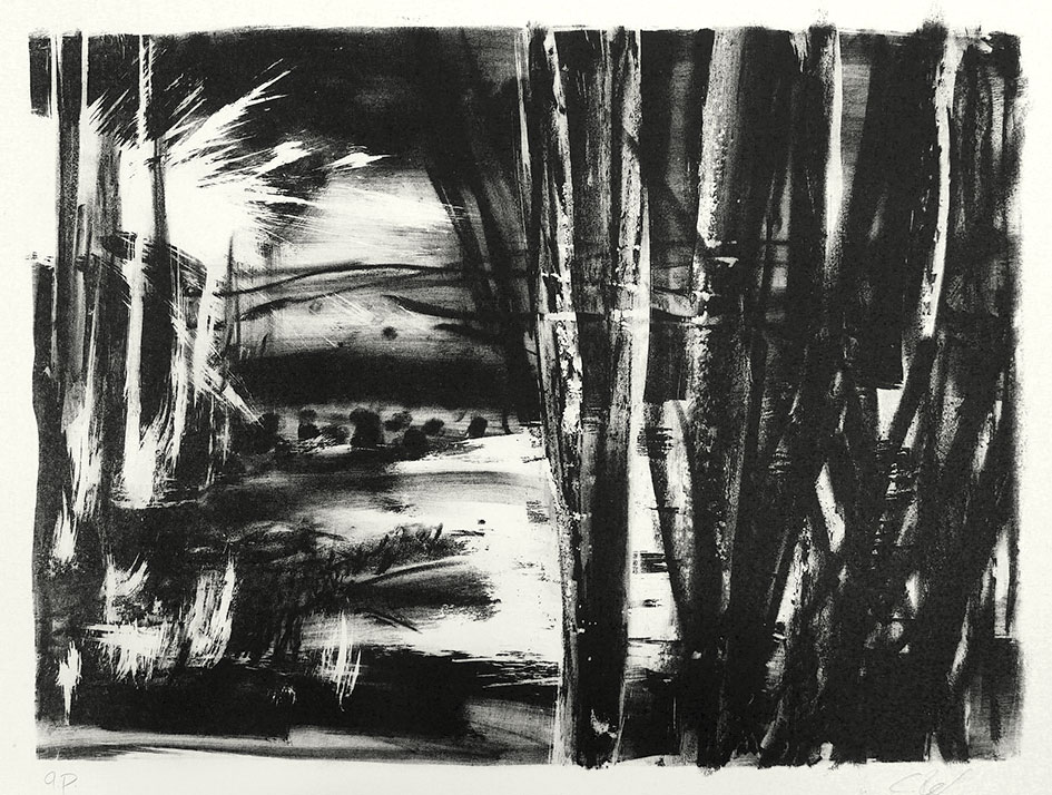
The staggering of the bushes and trees and the high horizon afford these pieces an undertow that, as a result of the reduced colors and the clear, mostly vertical traces left by its application, is simultaneously re-integrated into the surface. On smaller format black-and-white sheets the artist has even intensified this spot structure. Fingerprints and larger dark areas produce a rhythm that stands for itself. The larger format landscapes still in mind, however, here again one also recognizes a before and behind. Thus in the spots one imagines a spatiality as is peculiar to landscape.
In the larger sheets the artist experimented with different color sequences. However the palette remained reduced to earthy and blunt greens, only supplemented by a mostly subtly shaded pink. At the same time the changing intensity of the individual shades and the sequence of printing operations greatly alters the visual perspective. At times everything is encompassed in one area, at other times the layering and dimensions become the main focus. A comparison of the black-and-white with the color prints shows how much the color reinforces the impression of spatiality. In addition, the pinks employed in the iris printing give the landscapes a mysterious glow that is made even more intense by the light areas of the paper.
As already the case with the photographs of Christof Rehm, one is also tempted with the lithographs to characterize their subject, the empty landscape, as „romantic“. But what can this hackneyed adjective still describe in fact? That these pictures lack everything that distinguishes central European landscape today? We find - in the lithographs, at least - no power plant chimneys or clouds of smoke, no transmission line pylons, no wind turbines - these grotesque emblems of our hope for a better management of the environment We see no roads and not even a settlement. But maybe it's just our way of thinking - or that of the author of these lines - that takes it for granted that our countryside should be marked by all this, so that our/his eyes no longer even perceive the emptiness - or, to put it positively: the freedom and tranquillity - of undisguised landscape.
„Romantic“, then, would not so much characterize an attitude of turning away from the present-day living environment and imagining an untouched idyll as the freedom to depict something that the photographer has indeed come across in this state. Yet the adjective „romantic“ can also describe the beholder's astonishment that an artist portrays nature with a radical directness, just as first done by a Caspar David Friedrich. But the beholder who is so surprised in this way must also notice that his gaze is thrown back on the mere streaks and spots over and over again. He has before him an artifact and not a copy of nature. (The photographs demonstrate this by the primitive recording technique and the clearly visible pixels of the large-format prints.)
The painter seems to have no trouble in depicting landscapes, they veritably flow out of his hand; but this impression of the origination process is broken again at once by the scratches, the grain of the stone, the layering of the colors. Christof Rehm uses printing technology to gain a distance to the act of painting. Moreover, the alienation of the image and the artistic style by the printing technique increases the distance between the hand of the artist and the chosen subject. The choice of these empty, extensive landscapes may actually manifest a longing - for peace, space, virginity - which, however, is broken again at once by the cool style. (Yes, we simply have to break everything in the days of postmodernism.) What is more, Christof Rehm is not a print artist in the old sense. The possibility of the interplay of colors in each individual print interests him more than what reproduction, for which printing technology was after all once invented, has to offer.
It seems to me that, with these lithographs, which he has created over the past two years, Christof Rehm has only made a beginning. The game is opened and the fertilization of the older medium lithography by the younger photography already shows that the work on the stone stimulated painterly elements that offer something different than photography. In lithography the technical examination of the image idea becomes painting on paper and, what is more, on the subject matter of the apparently naive representation of nature. The dialogue of the media can commence.
.
Essay von Dr. A. Strobl, Staatliche Graphische Sammlung München
Übereinandergeschichtete Schlieren, Tupfer und Farbbatzen werden von Kratzern durchdrungen. Eigentlich handelt es sich ja bei den Lithographien von Christof Rehm nur um ruppig – zum Beispiel mit einem Lappen – hingewischte Spuren, aber man sieht ihre Bilder doch nicht als gegenstandslose Farbflächen. Unschwer assoziieren wir in diese Farbwolken klassisch gebaute Landschaften mit Vordergrund, Mittelgrund und Horizont. Die menschliche Wahrnehmung ist wohl auf diese schematische Entschlüsselung gepolt. Der Rhythmus der Flächenverteilung lässt uns Büsche, Bäume, kahle Wiesen oder Felder und – meist im oberen Drittel der Bilder – die Horizontlinie erkennen, an der ein Himmel ansetzt, der sich in seiner malerischen Behandlung kaum von der Landschaft unterscheidet.
Die Staffelung der Büsche und Bäume sowie der hohe Horizont geben diesen Bildern einen Tiefensog, der durch die reduzierten Farben und die deutlichen, meist vertikalen Spuren ihres Auftrags gleichzeitig wieder in die Fläche eingebunden wird. In kleinerformatigen schwarz-weißen Blättern hat der Künstler diese Fleckenstruktur noch forciert. Fingerabdrücke und größere dunkle Flächen ergeben einen Rhythmus, der für sich steht. Die großformatigeren Landschaftsbilder im Gedächtnis erkennt man aber auch hier wieder ein Davor und Dahinter. So imaginiert man in die Flecken eine Räumlichkeit, wie sie der Landschaft eigen ist.
In den größeren Blättern experimentierte der Künstler mit unterschiedlichen Farbfolgen. Dabei blieb die Farbskala jedoch auf Erd- und stumpfe Grüntöne reduziert, die nur von einem meist dezent unterlegten Rosa ergänzt werden. Die wechselnde Intensität der einzelnen Töne und der Abfolge der Druckvorgänge verändert dabei die Bildwirkung stark. Mal wird alles in die Fläche gebunden, mal wird die Staffelung der Prospekte zum Hauptthema. Der Vergleich der schwarz-weißen mit den farbigen Druck zeigt, wie sehr die Farbe den Eindruck der Räumlichkeit stärkt. Zudem geben die im Irisdruck eingesetzten Rosatöne den Landschaften ein geheimnisvolles Leuchten, das durch die hellen Stellen des Papiers noch intensiver wird.
Wie schon bei den Photographien Christof Rehms ist man auch bei den Lithographien versucht, ihr Sujet der menschenleeren Landschaft als »romantisch« zu charakterisieren. Aber was kann dieses abgegriffene Adjektiv eigentlich noch beschreiben? Dass in diesen Bildern alles fehlt, was die mitteleuropäische Landschaft heute kennzeichnet? Wir finden – in den Lithographien zumindest – keine Kraftwerkskamine, oder –rauchwolken, keine Masten der Fernleitungen, keine Windräder – diese grotesken Embleme der Hoffnung auf einen besseren Umgang mit unserer Umwelt. Wir entdecken keine Straßen und nicht einmal eine Ansiedlung. Aber vielleicht ist es ja auch nur unser Denken – oder das des Autors dieser Zeilen –, das sich sicher ist, dass unsere Landschaften von all diesem gezeichnet sein müsste, so dass unser/sein Blick die Leere – oder um es positiv zu formulieren: die Freiheit und Stille – unverstellter Landschaft gar nicht mehr wahrnimmt.
»Romantisch« würde dann also nicht eine Haltung charakterisieren, sich von der heutigen Lebenswelt abzuwenden und eine unversehrte Idylle zu imaginieren, sondern die Freiheit, etwas abzubilden, das der Photograph durchaus so vorgefunden hatte. Das Adjektiv ›romantisch‹ kann aber auch das Erstaunen des Betrachters beschreiben, dass da ein Künstler Natur in radikaler Direktheit schildert, wie dies zuerst eben eine Caspar David Friedrich getan hat. Doch der so überraschte Betrachter muss auch bemerken, dass sein Blick immer wieder auf die bloßen Schlieren und Flecken zurückgeworfen wird. Er hat ein Artefakt und kein Abbild der Natur vor sich. (Die Photos demonstrieren dies durch die primitive Aufnahmetechnik und die deutlich Sichtbaren Pixel der großformatigen Abzüge.)
Landschaftliches scheint dem Maler einfach aus der Hand zu fliesen; doch wird diese Anmutung im Entstehungsprozess gleich wieder durch Kratzer, die Körnung des Steins, die Schichtung der Farben gebrochen. Christof Rehm verwendet die Drucktechnik, um eine Distanz zum Akt des Malens zu gewinnen. Die Verfremdung des Bildes und der künstlerischen Handschrift durch die Drucktechnik vergrößert zudem die Distanz zwischen der Hand des Künstlers und dem gewählten Sujet. Es mag sich ja eine Sehnsucht in der Wahl dieser leeren, weiten Landschaften manifestieren – nach Ruhe, Weite, Unberührtheit –, die aber doch gleich wieder durch die coole Handschrift gebrochen wird. (Ja, wir müssen eben alles brechen, in den Zeiten nach der Postmoderne.) Ein Druckgraphiker im alten Sinne ist Christof Rehm übrigens nicht. Die Möglichkeit des Farbspiels in jedem einzelnen Abzug interessiert ihn mehr als das Angebot der Vervielfältigung, für das Drucktechniken doch früher einmal erfunden worden waren.
Mir scheint es, dass Christof Rehm mit diesen innerhalb von zwei Jahren entstandenen Lithographien erst einen Anfang gemacht hat. Das Spiel ist eröffnet und die Befruchtung des älteren Mediums Lithographie durch die jüngere Photographie zeigte bereits, dass die Arbeit auf dem Stein malerische Elemente belebte, die etwas anderes bieten als die Photographie. Die technische Auseinandersetzung mit der Bildidee wird in der Lithographie zur Malerei auf Papier und das gerade am Gegenstand scheinbar naiver Naturdarstellung. Der Dialog der Medien kann beginnen.
contact
Christof RehmPavillon am Berghof
Bergstrasse 12
86199 Augsburg
mail@christof-rehm.de
www.christof-rehm.de